JAGUAR TYPE 00 CELEBRATES GERMAN PREMIERE WITH ARTISTIC PRODUCTION IN MUNICH
by textschwester
JAGUAR TYPE 00 CELEBRATES GERMAN PREMIERE WITH ARTISTIC PRODUCTION IN MUNICH
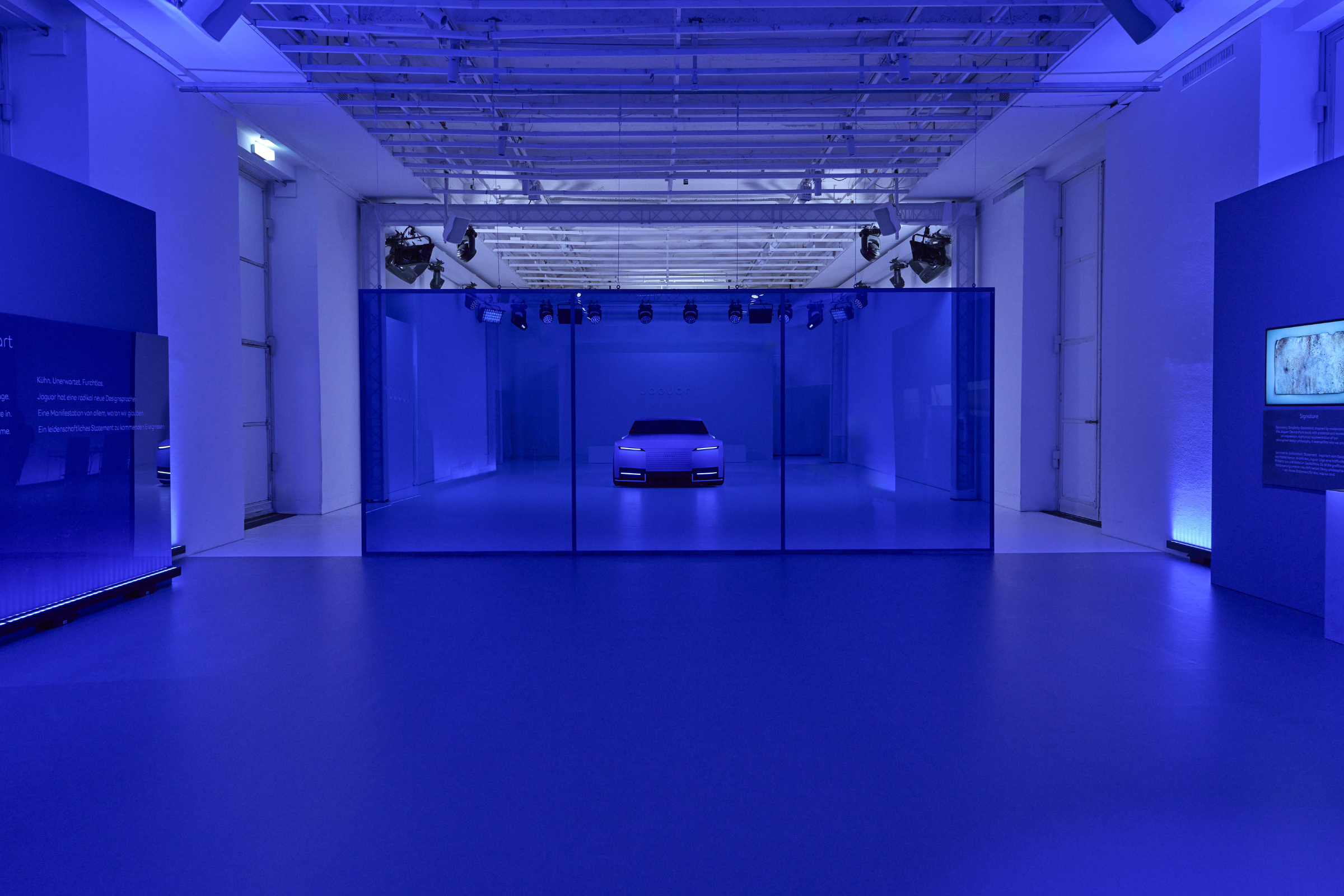
The Type 00 in French Ultramarine forms the centerpiece of the exhibition. The fearless new face of Jaguar is a foretaste of the future of the brand that echoes the ‘Copy Nothing’
ethos of its founder, Sir William Lyons.
Marc Lee, Jaguar Brand Director Europe, says: "Jaguar's brand ethos is driven by fearless creativity and revisits the original ‘Copy Nothing’ principle . The Type 00 is an example of Jaguar at its best. A concept with bold shapes and exuberant proportions that will inspire future Jaguar models. We look forward to showcasing our brand world in a creative space that serves to inspire, challenge convention and celebrate art in all its forms."
Unique experience
The Jaguar event in Munich is more than just an exhibition. The event, which is aimed at media representatives, content creators and art and culture lovers, offers a platform for creative encounters - with exclusive creator sessions and a unique visual staging that immerses guests in the new brand world of Jaguar.
The eye-catching French ultramarine blue is the focal point of the exhibition. Visitors to are immersed in a cross-border experience that merges a curated interior design with an innovative vehicle presentation.
Design Vision Concept full of courage: the Jaguar Type 00
The Jaguar Type 00 (pronounced: Type Zero Zero) is an example of Jaguar at its best: a fearless statement, with bold shapes and opulent proportions. The prefix “Type” refers to the brand's origins, to models such as the pioneering E-Type. The first zero stands for zero emissions, the second for a new beginning - for its status as car zero of a completely new model family.
Jaguar - re-imagined
Fearless, opulent, captivating - with the presentation of the new brand identity, a new era has begun for the brand, and not just visually, which goes beyond the redesign of the
vehicle range. Jaguar is returning to its roots as a pioneering luxury brand and is undergoing a transformation symbolized by four key changes:
The new brand signature (Device Mark) celebrates modernism - geometric shapes, symmetry and simplicity characterize its clean, pared-down expression.
Strikethrough is a bold, linear graphic that symbolizes the deliberate crossing out of imitation and ordinariness - a powerful statement of distinctiveness.
The brand emblems (Maker's Marks) are made up of the “Leaper” and the monogram . The Jaguar “Leaper”, a symbol of origin steeped in history, now consistently leaps forward
and stands for a progressive attitude and the representation of excellence. The new monogram replaces the previous “Growler”, which once represented the sound of classic combustion engines. With the “j” and “r” at opposite ends, the monogram figuratively reflects a contrast - and thus Jaguar's attitude of questioning conventions and breaking new ground.
Finally, the bold and expressive use of color is a central component of the new brand identity - deeply rooted in the connection to art. Each of these four changes is visible in the brand identity exhibition and comes to life in the Type 00.